CSS Float Left Example
In this example, we’ll explain a very useful CSS positioning property, float. The float CSS property specifies that an element should be taken from the normal flow and placed along the left or right side of its container, where text and inline elements will wrap around it. It is supported on all modern browsers and can be used with having to add extra prefixes.
Aside from the simple example of wrapping text around images, floats can be used to create entire web layouts. Float’s sister property is clear. An element that has the clear property set on it will not move up adjacent to the float like the float desires, but will move itself down past the float.
1. Basics
1.1 Document Setup
Go ahead and create a new html document and add the basic sytnax in it like so:
<!DOCTYPE html>
<html>
<head>
	<title>CSS3 Float Left Example</title>
</head>
<body>

<!-- STYLE SECTION -->

<style type="text/css">

</style>

<!-- HTML SECTION -->

</body>
</html>
1.2 Syntax and Values
Just like all css properties, the syntax for float follows the format: .class/tag { property: value; }, in this case: float: value;.
The values this property can take are:
float: left; – indicates that the element must float on the left side of its containing block.
float: right; – indicates that the element must float on the right side of its containing block.
float: none; – indicates that the element must not float.
/* Global values */
float: inherit;
float: initial;
float: unset;
1.3 Application
Let’s see the very first and basic application of the float property. First add some elements to the html like below:
<!-- HTML SECTION  -->
<div class="wrapper">
    <h3>Title goes here</h3>
    <p>Bacon ipsum dolor amet tail corned beef beef, brisket biltong shoulder shankle chicken. Jerky shoulder ham tongue leberkas, spare ribs shankle andouille flank pancetta. Jerky meatloaf chuck, sausage turducken venison shank. Rump tenderloin bresaola pork chop. Tail pancetta picanha cow pastrami, boudin alcatra pig ribeye. Ball tip t-bone short loin ground round. Rump prosciutto bacon pork belly filet mignon.</p>
    <img src="image.png">
</div>
<!-- STYLE  SECTION -->
<style type="text/css">
body {
    font-family: "Neris";
}
.wrapper {
    margin: 2em;
}
img {
    float: left;   /* display image on the left side of the document */
}
</style>
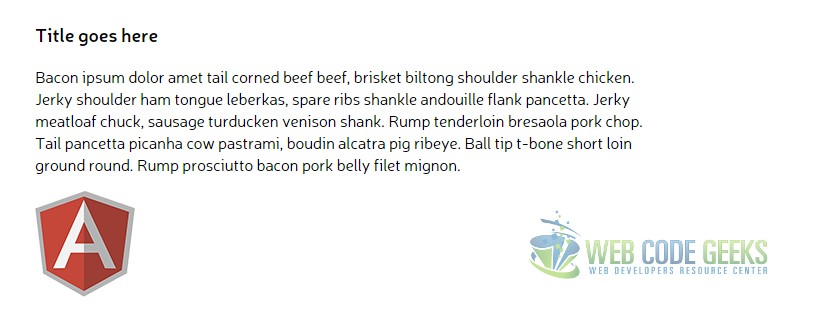
Pretty straight forward, in the browser it would look like this:
Well, this might seem dissapointing for now, because as you can see, the image is right where it could normally be without using the float property. This is because the default state of a new element is top left, after the previous element, that is why you see that image right there. In a general viewpoint, float forces the element to align left/right. To understand this better, follow along in the next section.
2. Getting to Know Float Better
2.1 Understanding Positioning Cases
You just saw how we floated an image on the left side of our document, but that didn’t seem to be any different from the default state. Let’s see a more specific case where the image has some text before it in the code, which will normally move the image a little bit right, but that doesn’t happen because of float: left, and this is where it starts to become interesting. Change the HTML like so:
<!-- HTML SECTION  -->

Just random text here!  <img src="image.png">
Without changing the CSS, look at the result we’d get:
Notice how even though the text was before the image in our HTML, they switched places because of the float: left; property applied to the img element. That forced the image to override any other element on the left by moving them to the right, and positioning itself most left than any other.
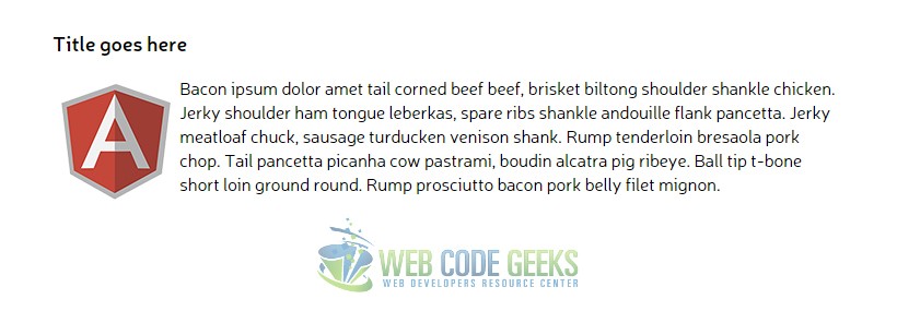
But what if we wanted to align the image left/right in the same space used by the paragraph, not below it? Well, you can do that by including the img element inside our paragraph element and that will enable the image to alight left/right relating to the paragraph like this:
<!-- HTML SECTION  -->
<div class="wrapper">
    <h3>Title goes here</h3>
    <p><img src="image.png"> Bacon ipsum dolor amet tail corned beef beef, brisket biltong shoulder shankle chicken. Jerky shoulder ham tongue leberkas, spare ribs shankle andouille flank pancetta. Jerky meatloaf chuck, sausage turducken venison shank. Rump tenderloin bresaola pork chop. Tail pancetta picanha cow pastrami, boudin alcatra pig ribeye. Ball tip t-bone short loin ground round. Rump prosciutto bacon pork belly filet mignon.</p>
</div>
Now we’d have an image wrapped on the left, and it would look like this:
2.2 Multiple Element on Float
Now let us look at the case where the property is applied to multple inline elements. If two or more elements will have the property float:left; then the first one of them is going to be aligned in the most left hand of the page. Think of it just like the normal state of these elements. Look at the html below where we have created a new wrapper containing 3 boxes and a span element with text inside.
<div class="wrapper1">
    <h3>Title goes here</h3>
    <div class="box box1">Float Left - Box 1</div>
    <span>I'm not floated at all.</span>
    <div class="box box2">Float Left - Box 2</div>
    <div class="box box3">Float Left - Box 3</div>
</div>
And in the styles, we’ve given them all float: left; property and some bg-colors to make them distinct.
.box {
    width: 200px;
    height: 100px;
    border: 1px solid #ccc;
    margin-right: 1em;
    text-align: center;
    display: inline-block;
    line-height: 6em;
    float: left;
}

.box1 {
    background-color: gray;
    color: white;.
}

.box2 {
    background-color: green;
    color: white;.
}

.box3 {
    background: purple;
    color: white;
}
Normally, the boxes would all align left, and that would seem to make no difference from the default state:
In a similar manner, if we were to change the float property from applying it to all boxes to just two boxes, those two particular boxes would align left but in the order specified in the HTMl code, meaning if we floated the 2nd and 3rd box to the left only, they’d both float left but 2nd box would be positioned before 3rd box. Here it is:
.box1 {
    background-color: gray;
    color: white;
    /*no float here*/
}

.box2 {
    background-color: green;
    color: white;
    float: left;
}

.box3 {
    background: purple;
    color: white;
    float: left;
}
As you’d imagine, we’d get this:
3. Conclusion
To conclude, the float property is a very useful CSS tool that allows better element alignment and overall positioning. Genereally speaking, float: left is going to seem just like the normal default state most of the times, but do remember that when things get messy around the page and you don’t get elements positioned like you want, float: left is going to be of much help because of its force state positioning.
4. Download
You can download the full source code of this example here: CSS Float Left


