Bootstrap Navbar Example
The aim of this example is to show how to create a navbar using Bootstrap. Bootstrap is the world’s most famous front-end framework. Navbars are responsive meta components that serve as navigation headers for your application or site. They begin collapsed (and are toggleable) in mobile views and become horizontal as the available viewport width increases.
Navbars are important part of websites because they provide a very functional and easy way for users to navigate the several pages of your websites. A navbar typically contains a logo, menu items (with some dropdowns) and optionally a search box.
1. Project Setup
In order to begin, first create a new project folder and add all necessary bootstrap components. Make sure you have the following folder structure in your project folder:
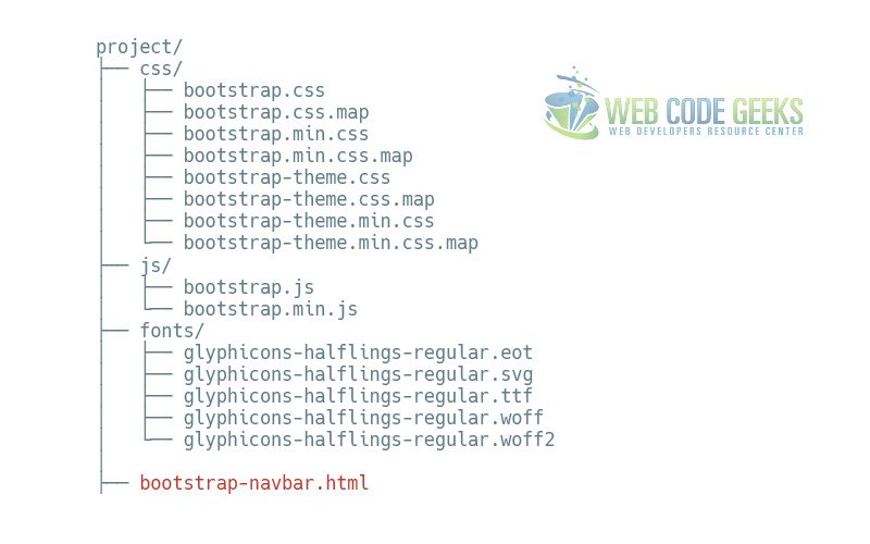
Next, in the bootstrap-navbar.html file add the basic syntax:
<!DOCTYPE html>
<html lang="en">
  <head>
    <meta charset="utf-8">
    <meta http-equiv="X-UA-Compatible" content="IE=edge">
    <meta name="viewport" content="width=device-width, initial-scale=1">
    <title>Bootstrap Navbar Example</title>

    <!-- Bootstrap -->
    <link href="css/bootstrap.min.css" rel="stylesheet">
  </head>
  <body>

    <!-- jQuery (necessary for Bootstrap's JavaScript plugins) -->
    <script src="https://www.webcodegeeks.com/wp-content/litespeed/localres/aHR0cHM6Ly9hamF4Lmdvb2dsZWFwaXMuY29tL2FqYXgvlibs/jquery/1.11.3/jquery.min.js"></script>
    <!-- Include all compiled plugins (below), or include individual files as needed -->
    <script src="js/bootstrap.min.js"></script>
  </body>
</html>
Note that everything else except jQuery library is linked locally.
2. Default Navbar
The default navbar represent the most complete navbar Bootstrap can offer as of version 3. Let’s first see it and then explain every bit of code. The following code needs to be set inside the body tag of your HTML.
<nav class="navbar navbar-default">
  <div class="container-fluid">
    <!-- Brand and toggle get grouped for better mobile display -->
    <div class="navbar-header">
      <button type="button" class="navbar-toggle collapsed" data-toggle="collapse" data-target="#bs-example-navbar-collapse-1" aria-expanded="false">
        <span class="sr-only">Toggle navigation</span>
        <span class="icon-bar"></span>
        <span class="icon-bar"></span>
        <span class="icon-bar"></span>
      </button>
      <a class="navbar-brand" href="#">Brand</a>
    </div>

    <!-- Collect the nav links, forms, and other content for toggling -->
    <div class="collapse navbar-collapse" id="bs-example-navbar-collapse-1">
      <ul class="nav navbar-nav">
        <li class="active"><a href="#">Link <span class="sr-only">(current)</span></a></li>
        <li><a href="#">Link</a></li>
        <li class="dropdown">
          <a href="#" class="dropdown-toggle" data-toggle="dropdown" role="button" aria-haspopup="true" aria-expanded="false">Dropdown <span class="caret"></span></a>
          <ul class="dropdown-menu">
            <li><a href="#">Action</a></li>
            <li><a href="#">Another action</a></li>
            <li><a href="#">Something else here</a></li>
            <li role="separator" class="divider"></li>
            <li><a href="#">Separated link</a></li>
            <li role="separator" class="divider"></li>
            <li><a href="#">One more separated link</a></li>
          </ul>
        </li>
      </ul>
      <form class="navbar-form navbar-left" role="search">
        <div class="form-group">
          <input type="text" class="form-control" placeholder="Search">
        </div>
        <button type="submit" class="btn btn-default">Submit</button>
      </form>
      <ul class="nav navbar-nav navbar-right">
        <li><a href="#">Link</a></li>
        <li class="dropdown">
          <a href="#" class="dropdown-toggle" data-toggle="dropdown" role="button" aria-haspopup="true" aria-expanded="false">Dropdown <span class="caret"></span></a>
          <ul class="dropdown-menu">
            <li><a href="#">Action</a></li>
            <li><a href="#">Another action</a></li>
            <li><a href="#">Something else here</a></li>
            <li role="separator" class="divider"></li>
            <li><a href="#">Separated link</a></li>
          </ul>
        </li>
      </ul>
    </div><!-- /.navbar-collapse -->
  </div><!-- /.container-fluid -->
</nav>
In the browser, the navbar would look like this:

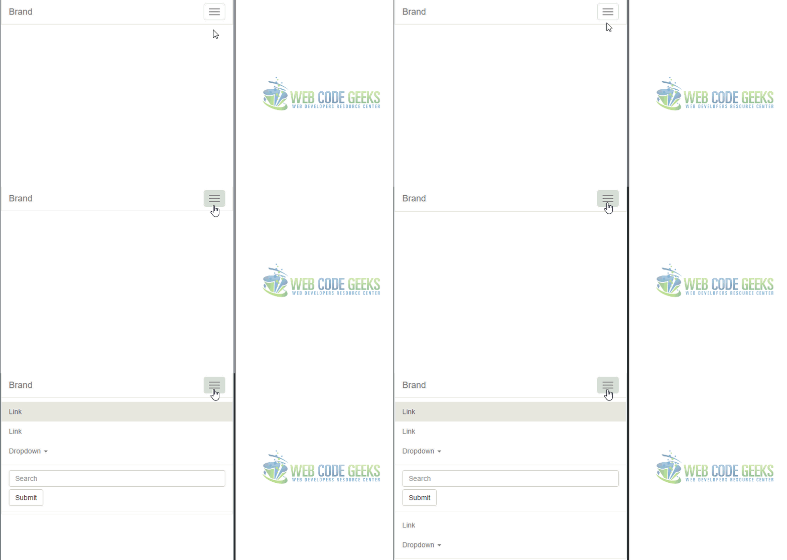
If you shrink the browser to a smaller size the navbar would transform, so in small devices like mobile phones, you’d have a dropdown button that would react like so when you tap:
3. Navbar Components
In this section, we’ll be explaining the parts of navbar used to make it the way it is. As a starting point, let’s notice that the navbar is wrapped inside the common HTML5 tag nav. There are two classes given to this tag. navbar defines a navbar compontent of bootstrap styling and the other, navbar-default expresses a variation used among the available navbars. Next, inside a div which shall lie in 100% browser width (made possible by the class container-fluid, everything is put.
3.1 Navbar Header
The navbar header (not to be confused, as the navbar is already a header as a whole) is just a grouping of the brand element (dedicated space for your logo image or name) and the necessary dropdown button (which only gets shown on small devices).
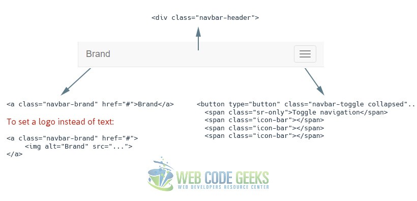
As you might wonder what that span with a class of sr-only is doing there, just know that uou should always consider screen readers for accessibility purposes. That is why you don’t see any difference when you remove that line. The attributes of the button (not shown all in the image) just extend functionality and takes advantage of Bootstrap’s predefined classes and attributes functionality.
3.2 Navbar Links and Dropdowns
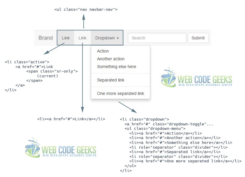
This sections opens with a div given a class of collapse navbar-collapse which enables this whole section to be collapsed and an id bs-example-navbar-collapse-1 which corresponds to the id given to the button element in the header section (so the button would trigger this part of the code).
3.3 Forms
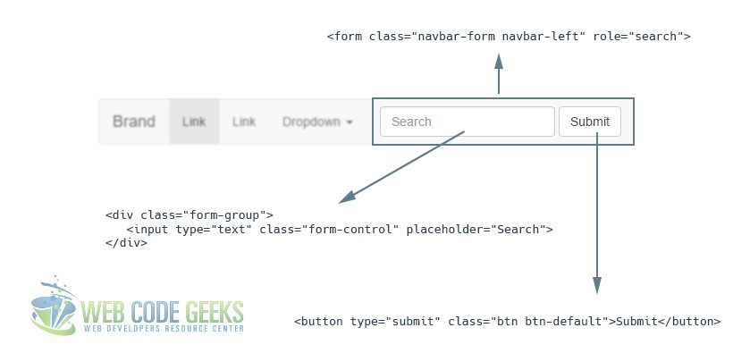
Part of a navbar may be a form element usually made of a search box input and a button which will trigger the search functionality. Therefore, a form element is created witht he appropriate classes navbar-form (defines form styling) and navbar-left (defines form positioning) and then every kind of input is grouped under a div with a class of form-group (in this case, only one input). Then, optionally, a button is added to complete the form.
Note that the default navbar we declared in the beginning also has two other menu items, a link and a dropdown, but because we already saw how they can be created, no further explanation is nexessary.
4. Static and Fixed Navbar
There exist three main ways of navbar positioning in your webpage. They are Fixed to Top, Fixed to Bottom, and Static navbars.
4.1 Fixed to Top
Add .navbar-fixed-top and include a .container or .container-fluid to center and pad navbar content. This will keep the navbar to the top of the page regardless of the user scroll through the page. The markup would look like this:
<!-- NAVBAR FIXED TOP -->

<nav class="navbar navbar-default navbar-fixed-top">
  <div class="container">
    ...
  </div>
</nav>
The fixed navbar will overlay your other content, unless you add padding to the top of the body. By default, the navbar is 50px high.
4.2 Fixed to Bottom
Add .navbar-fixed-bottom and include a .container or .container-fluid to center and pad navbar content. This will keep the navbar to the bottom of the page regardless of the user scroll through the page. The markup would look like this:
<!-- NAVBAR FIXED BOTTOM -->

<nav class="navbar navbar-default navbar-fixed-bottom">
  <div class="container">
    ...
  </div>
</nav>
The same padding is required for this case, like padding-bottom: 70px;
4.3 Static
Create a full-width navbar that scrolls away with the page by adding .navbar-static-top and include a .container or .container-fluid to center and pad navbar content. Unlike the .navbar-fixed-* classes, you do not need to change any padding on the body. The markup would look like this:
<!-- NAVBAR STATIC TOP -->

<nav class="navbar navbar-default navbar-static-top">
  <div class="container">
    ...
  </div>
</nav>
5. Conclusion
To conclude, just like any other framework, Bootstrap’s mission is to make coding as easy as possible, at the same time, providing well-organized classes and structure of the hierarchy as a whole. Navbars are probably one of the elements found on every single website. They vary from design and number of elements, but the core remains the same when using the framework. The default navbar can be customized in a number of ways that you can try at your own pace.
6. Download
You can download the full source code of this example here: Bootstrap Navbar



1) This code does not work with BS 4.
2) Why don’t you link to the css on CDNs instead of locally?