CSS Radio Button Example
Ever wondered how to style checkboxes and radio buttons, but without JavaScript? Thanks to CSS3 you can! The aim of this example is to show the creation, modification and usage of radio buttons using HTML and CSS3.
Radio buttons make it easier to select an item within a list of items that can be selected, simple as one click. Unlike dropdowns, they are visible and just right for the user to interact in simple ways.
The input type radio is supported by all modern browsers, and even what we’re doing in this tutorial is accessible from any browser as long as we’ll be using CSS3 to style and modify radio buttons, using properties and attributes.
1. Basic Document Setup
Go ahead and create a new html document and add the basic sytnax in it like so:
<!DOCTYPE html>
<html>
<head>
	<title>CSS3 Radio Button Example</title>
</head>
<body>

<!-- STYLE SECTION -->

<style type="text/css">

</style>

<!-- HTML SECTION -->

</body>
</html>
The two sections, HTML and CSS, will be the ones where content is going to be added. Let’s see a basic radio button.
<input type="radio">Click me please
Note that radio buttons are created out of input elements in HTML, inputs with a type of radio. There’s been no styling on the input we just added on html, so the view in the browser would reflect the default properties that radio buttons have:
So that was just a very basic, HTML only based, radio button. Below, we’ll go deeper into styling and creating customized design.
2. Styling Radio Buttons
Whenever you feel even details should be of your own perspective on your site, you’ll be considering creating a custom radio button. Let’s start off with a really cool example of styling radio buttons with different colors, borders and even animations. Look at the code below:
<!-- HTML SECTION  -->

<label for="radio-one">
<input type="radio" value="radio-one" name="quality" id="radio-one"> <span>radio one</span>
</label>

<label for="radio-two">
<input type="radio" value="radio-two" name="quality" id="radio-two"> <span>radio two</span>
</label>

<label for="radio-three">
<input type="radio" value="radio-two"  name="quality" id="radio-three" checked> <span>radio three</span>
</label>
So, we’ve set up a structure with three radio buttons, each of which is going to have some text next to it as a label.
The CSS would contain the properties to design the radio button before and after being checked (clicked).
<!-- STYLE  SECTION -->
<style type="text/css">
@import url(http://fonts.googleapis.com/css?family=Cabin:700);

/* HTML5 Boilerplate radio-one hidden styles */
[type="radio"] {
  border: 0;
  height: 1px; margin: -1px;
  padding: 0;
  position: absolute;
  width: 1px;
}

/* One radio button per line */
label {
  display: block;
  cursor: pointer;  /*hand view when on hover*/
  line-height: 2.5;
  font-size: 1.5em;
}

/* the basic, unchecked style */
[type="radio"] + span:before {
  content: '';
  display: inline-block;
  width: 1em;
  height: 1em;
  vertical-align: -0.25em;
  border-radius: 1em;           /*hard border*/
  border: 0.125em solid #fff;
  box-shadow: 0 0 0 0.15em #000;   /*light shadow*/
  margin-right: 0.75em;
  transition: 0.5s ease all;    /*animation here*/
}

/* the checked style using the :checked pseudo class */
[type="radio"]:checked + span:before {
  background: #33a2c6;
  box-shadow: 0 0 0 0.25em #000;
}

/* body attributes here */
body {
  margin: 3em auto;
  max-width: 30em;
  font-family: Cabin, serif;
}
</style>
The view we’d get would be pretty impressive:
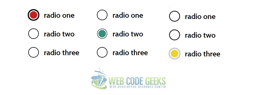
Adittionally, you could have different broder thickness, colors and more, just by changining the values above. Here is what it would look like in some examples.
Another nice example of a customized radio button is shown below:
<!-- HTML SECTION  -->
<div>
  <input type="radio" id="radio01" name="radio" />
  <label for="radio01"><span></span>Radio Button 1</label>
</div>

<div>
 <input type="radio" id="radio02" name="radio" />
 <label for="radio02"><span></span>Radio Button 2</label>
</div>
<!-- STYLE  SECTION -->
<style type="text/css">
div {
  margin: 0 0 0.75em 0;
}

input[type="radio"] {
  display: none;
}

input[type="radio"] + label {
  color: #292321;
  font-family: Arial, sans-serif;
  font-size: 14px;
}

input[type="radio"] + label span {
  display: inline-block;
  width: 19px;
  height: 19px;
  margin: -1px 4px 0 0;
  vertical-align: middle;
  cursor: pointer;
  -moz-border-radius: 50%;
  border-radius: 50%;
}

input[type="radio"] + label span {
  background-color: #292321;
}

input[type="radio"]:checked + label span {
  background-color: #CC3300;
}

input[type="radio"] + label span,
input[type="radio"]:checked + label span {
  -webkit-transition: background-color 0.4s linear;
  -o-transition: background-color 0.4s linear;
  -moz-transition: background-color 0.4s linear;
  transition: background-color 0.4s linear;
}
</style>
This time, the view would be more flat and minimalistic:
3. Adding Functionality to the Radio Button
Radio buttons are almost always grouped together in groups. Only one radio button within the same form may be selected at a time. The user can switch which radio button is turned on by selecting it with the mouse or keyboard. Other radio buttons in the same group are turned off. A label, specified with the label attribute may be added beside the radio button. Thus, we would have a functional form with radio buttons inside, which would look like this in code:
<form action="">
<label for="male">
<input type="radio" name="sex" value="male">Male<br></label>
<label for="female">
<input type="radio" name="sex" value="female">Female</label>
</form>
Well, pretty simple view, we’ve considered only functionality here.
4. Conclusion
To conclude, radio buttons are very useful elements of CSS, to get data/information from the user selection. In most cases, default radio buttons will fit just okay to your needs. However, there might be cases you want to change that creepy style that default holds and unleash your own design concepts. This is often considered when applied on artistic websites, as well as surveying sites because the size and colors need to fit the whole page context.
5. Download
You can download the full source code of this example here: CSS3 Radio Button


