How Has Vertical Alignment Become Easy With CSS Subgrid?
Do you know Grids and alignment both these CSS properties are always talked about together? Why? Because of the nature of their existence and the mess alignment creates on different screen devices. How easy and convenient would web developers’ lives become if all the devices in this world existed with the same screen size. Damn! That’s a dream. But coming back to reality, we have to deal with hundreds of devices with varying screen sizes, and the problem they create for the developers with alignment is an add-on. CSS Grids and CSS Subgrids were introduced to tackle the alignment problem with multiple elements existing side by side.
Grids were responsive, and instead of “hit and try” of pixel and margin values, setting display: grid worked like a charm. As time stands witness to the issues tackled by web developers, if they do not have one, they invent one themselves. Now the developers have started to create complex web designs with one grid nested with other grids. That was a makeshift arrangement, and making it work was an endeavor in itself.
Frustrated by the complaints of web developers, CSS included an updated library for the subgrids. I created a full post on the topic; if you are not aware of CSS’s CSS Grids property, it is highly recommended to go through what is CSS Grids and CSS Subgrids. This post is based on a very important situation handled by subgrid, i.e., solving the vertical alignment problem. But before coming to the solution, I understand that vertical alignment requires a little bit of detailing in itself. Therefore, I will analyze what this problem is to help you recognize it when it occurs during your website development.
Need for Vertical Alignment
The vertical alignment problem occurs when we wrestle with the responsiveness of the website. But do you know it is relatively easy to adjust a website according to the screen with absolute numbers with fixed screen size? For example, consider the below code:
|
01
02
03
04
05
06
07
08
09
10
11
12
13
14
15
16
17
18
19
20
21
22
23
24
25
26
27
28
29
30
31
32
33
34
35
36
|
<!DOCTYPE html><html lang="en" dir="ltr"> <head> <meta charset="utf-8"><link rel="stylesheet" href="https://stackpath.bootstrapcdn.com/bootstrap/4.5.2/css/bootstrap.min.css" integrity="sha384-JcKb8q3iqJ61gNV9KGb8thSsNjpSL0n8PARn9HuZOnIxN0hoP+VmmDGMN5t9UJ0Z" crossorigin="anonymous" /> <title>Subgrids</title> <style> fieldset { width: 45%; float: left; margin-right: 1%;} @media only screen and (max-width: 480px) {fieldset {width: 100%;} </style> </head> <body style = "margin-top: 10%; margin: 5%"> <fieldset> <legend>Interests:</legend> <button class = "btn btn-success">Travel and Adventure</button> <button class = "btn btn-success">Literature</button> </fieldset> <fieldset> <legend>Language</legend> <button class = "btn btn-success">English</button> <button class = "btn btn-success">Korean</button> </fieldset> </body></html> |
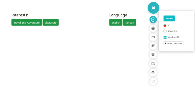
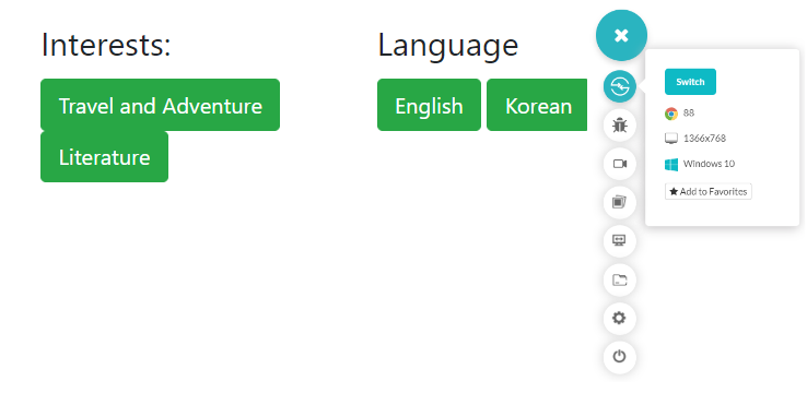
To organize content on the webpage, I use the fieldset tag to arrange two buttons for that category. On a desktop screen using Firefox, the webpage looks like the following:
Looks fine right? But what happens when it comes to the responsiveness of the website? Will we see the same results then? Let’s find it out.
There are various tools available in the market to check the responsiveness of your website. One such tool is LT Browser, which allows you to perform live mobile view debugging of your website on mobile and tablet simultaneously and see their impact on the go on over 45+ devices!
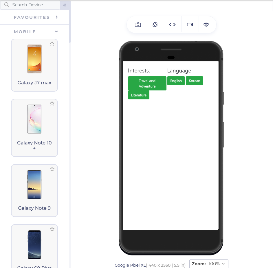
Running the same code on the LT Browser will show us the following results on Google Pixel:
It crashed – this is the vertical alignment problem. As the screen size has reduced, we cannot align the elements correctly on the web page, particularly column-wise. Even if the elements can be seen inside the fieldset and understood that they belong to which fieldset, they are not correctly resized. I have used bootstrap in the above code to achieve the visible CSS button.
Alright then, what could be the first step in achieving responsiveness and proper vertical alignment? If you are thinking about “div,” then that probably would not work. A div box will wrap the elements inside it into a box, ultimately providing the boundary flexibility, but the elements would not fall into a proper structure. What about CSS Grids? Maybe a grid would work! Let’s find that out.
Vertical Alignment using Grids
A CSS Grid would be the primary choice for organizing the elements “the responsive way,” especially while dealing with elements inside a container. Let’s change the above code with the same intentions to wrap both of the fieldsets inside the grid structure.
|
01
02
03
04
05
06
07
08
09
10
11
12
13
14
15
16
17
18
19
20
21
22
23
24
25
26
27
28
29
30
31
32
33
34
35
36
37
38
39
40
41
|
<!DOCTYPE html><html lang="en" dir="ltr"> <head> <meta charset="utf-8"><link rel="stylesheet" href="https://stackpath.bootstrapcdn.com/bootstrap/4.5.2/css/bootstrap.min.css" integrity="sha384-JcKb8q3iqJ61gNV9KGb8thSsNjpSL0n8PARn9HuZOnIxN0hoP+VmmDGMN5t9UJ0Z" crossorigin="anonymous" /> <title>Subgrids</title> <style> fieldset { width: 45%; float: left; margin-right: 1%;} @media only screen and (max-width: 480px) {fieldset {width: 100%;} .grid {display: grid} </style> </head> <body style = "margin-top: 10%; margin: 5%"><div class = “grid”> <fieldset> <legend>Interests:</legend> <button class = "btn btn-success">Travel and Adventure</button> <button class = "btn btn-success">Literature</button> </fieldset> <fieldset> <legend>Language</legend> <button class = "btn btn-success">English</button> <button class = "btn btn-success">Korean</button> </fieldset></div> </body></html> |
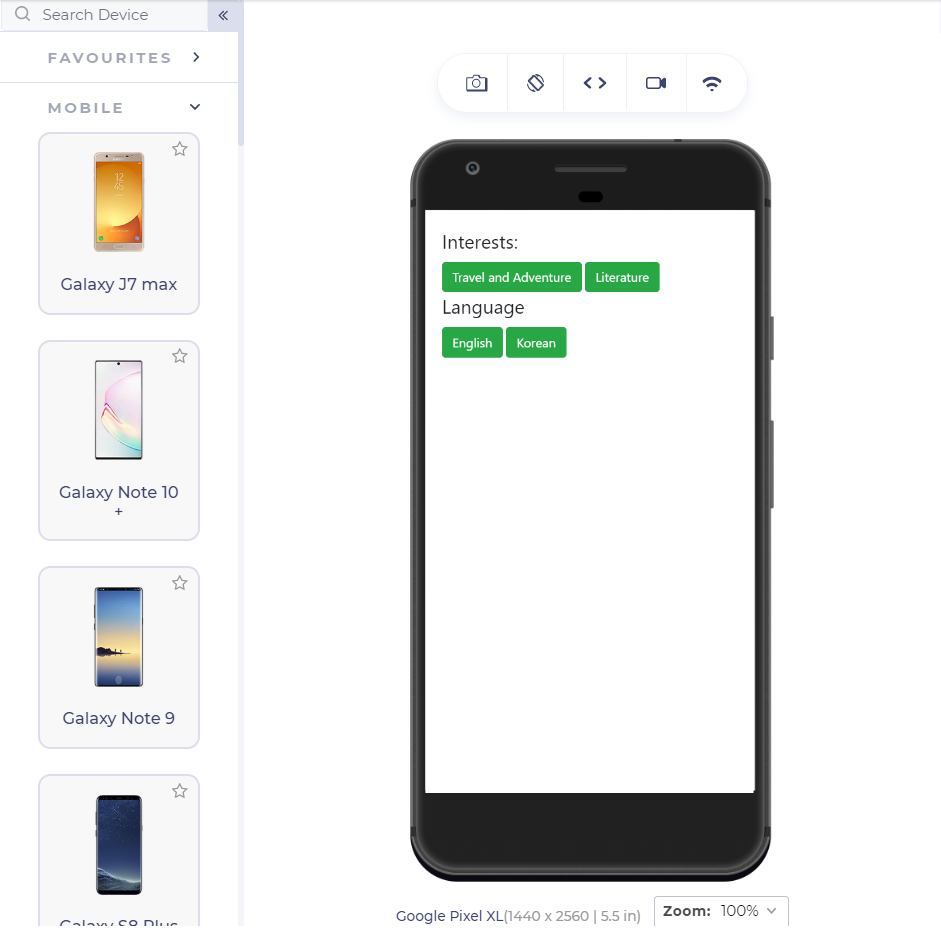
Running the above-given code on the LT Browser will show us the following results:
Alright! We do have some progress now. The grid structure has defined proper boundaries and flexibility to the elements. But, we are still not able to align the elements vertically. Notice the button with the text “English” and the button just above it with the text “Travel and Adventure.” Both of the Language category buttons are inside a single button’s margins, “Travel and Adventure.” Therefore, we need to work on our vertical alignment.
In the above web page, it is clear that although the grid structure is maintained, the lower buttons need to adjust themselves according to the parent element. Since the parent element will provide a fixed-length boundary, the lower elements will automatically adjust according to the same element. This reminds me of CSS subgrids and their property of being dependent on the parent grid. It is worth trying to incorporate subgrid into our code and observe any changes we get on the web page.
Vertical Alignment using Subgrids
Subgrids are the newly introduced member of the CSS family inside the grids. Subgrids are very easy to code and completely erase the headache of using nested grids, which require extremely carefully calculated numbers as the values. Subgrids can be used on either axis (unlike flexbox) or both axis simultaneously. Since here we are dealing with the column adjustment, we will use the subgrids on the columns.
The following adjustment in the code (addition of subgrids to each fieldset) will incorporate the subgrids:
|
01
02
03
04
05
06
07
08
09
10
11
12
13
14
15
16
17
18
19
20
21
22
23
24
25
26
27
28
29
30
31
32
33
34
35
36
37
38
39
40
41
42
43
44
45
46
47
48
49
50
51
|
<!DOCTYPE html><html lang="en" dir="ltr"> <head> <meta charset="utf-8"><link rel="stylesheet" href="https://stackpath.bootstrapcdn.com/bootstrap/4.5.2/css/bootstrap.min.css" integrity="sha384-JcKb8q3iqJ61gNV9KGb8thSsNjpSL0n8PARn9HuZOnIxN0hoP+VmmDGMN5t9UJ0Z" crossorigin="anonymous" /> <title>Subgrids</title> <style> fieldset { width: 45%; float: left; margin-right: 1%;} @media only screen and (max-width: 480px) {fieldset {width: 100%;} .grid { display : grid;} .subgrid { display : grid; grid-template-columns: subgrid;} </style> </head> <body style = "margin-top: 10%; margin: 5%"> <div class = "grid"> <fieldset> <div class = "subgrid"> <legend>Interests:</legend> <button class = "btn btn-success">Travel and Adventure</button> <button class = "btn btn-success">Literature</button> </div> </fieldset> <fieldset> <div class="subgrid"> <legend>Language</legend> <button class = "btn btn-success">English</button> <button class = "btn btn-success">Korean</button> </div> </fieldset> </body></html> |
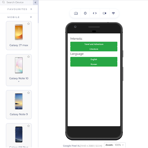
The above code will show the following results in the Google Pixel:
Voila! We get a similar width wrapped around a grid element by using the subgrid property. You can apply space and other styles to the web page to make it prettier.
It does look nice now, and there is no problem for the desktop user since the changes won’t reflect a screen of such a large resolution. But there is one downside in using this property: its acceptance!
Browser Compatibility
The browser acceptance of CSS Subgrids is rather poor. CSS Subgrids are not yet incorporated as a standard property into the browser at the time of writing this post. Although Firefox has rolled out the update with subgrid included, that would satisfy around 4% of the people.
After reading this post, you must get an idea of how it becomes easy to align the elements when we use subgrids with them, right? Therefore, do not undermine them by their current acceptance into the market. They will surely be enrolled in every browser with time.
Related Read: Detailed Guide To CSS Supports In Browsers
Achieving Vertical Alignment on Unsupported Browsers
As you can see in the previous section, the browser compatibility of CSS Subgrids is terrible, and it is better to be prepared with the backup until major browsers start supporting the property. If we use subgrids without any backup, we get the following alignment problem:
To manage the vertical alignment without CSS Subgrids, you can consider a couple of ways. The first route is to start the “hit and try” method and bring out a compromisable number that can be used as the percentage. Although you might get good results on your personal browser for absolute numbers too, absolute numbers should never be used when we talk about serving such a large variety of screens.
Secondly, you can use the flex-box and CSS Grids to implement the vertical alignment. It would take a few lines of extra code, but CSS Grids and flex-box are responsive in nature, and therefore you don’t need to worry about how well they render on different devices.
Using the vertical alignment with CSS Subgrids is the best path to take, but it seems like we might have to wait a little bit to implement them freely on our webpage. Until then, these turnarounds will help you in the process, and ultimately, that’s what the user wants: a vertical alignment, no matter how we get it.
Conclusion
Web developers have long been struggling with the alignment and organizing elements into the web page. A single nested element can take up a whole day to adjust according to the different screen sizes using the media queries and other CSS properties. One of the most challenging problems among them has always been the vertical alignment of the elements. Since elements scale up and down on different devices, they lose their fixed position and randomly leave a mess on the web page. CSS Subgrids is the best way to tackle the vertical alignment problem because they depend on the parent grid for their position.
Therefore, whenever a grid scales up or down, the subgrid does not independently make the decision, keeping the position intact on smaller screen devices and desktops. Keep in mind that vertical alignment is a tricky business. It might look alright on the device you are coding but may break down on some devices. Therefore, even though your element might align correctly, always pay caution to such elements. Whenever it comes to vertical alignment and column restructure of elements, go ahead with CSS Subgrids.
Thank you for reading. If you have any issues or questions, don’t hesitate to reach out via the comment section.
|
Published on Web Code Geeks with permission by Harish Rajora, partner at our WCG program. See the original article here: How Has Vertical Alignment Become Easy With CSS Subgrid? Opinions expressed by Web Code Geeks contributors are their own. |

