jQuery UI Accordion Example
The aim of this example is to go through jQuery UI Accordion. The .accordion(options) method declares that an HTML element and its contents should be treated and managed as accordion menus. The options parameter is an object that specifies the appearance and behavior of the menu involved.
Accordions are more and more finding their way into websites as navigation through a lot of pages and content is getting boring. That’s where accordions play an important role in organising content into expandable boxes which can have a lot of options to be customized just the way you want.
We’ll start with a basic application and then will explore more advanced options.
1. Basic Document Setup
To begin, create a new HTML document and add the following syntax in it:
<!DOCTYPE html>
<html>
<head>
	<title>jQuery UI Accordion Example</title>
       <meta charset="utf-8">
<!-- LINKS SECTION  -->
<link href="http://ajax.googleapis.com/ajax/libs/jqueryui/1.11.4/themes/smoothness/jquery-ui.css" rel="stylesheet" type="text/css"/>
<script src="http://ajax.googleapis.com/ajax/libs/jquery/1.11.3/jquery.min.js"></script>
<script src="http://ajax.googleapis.com/ajax/libs/jqueryui/1.11.4/jquery-ui.min.js"></script>
<link href="style.css" rel="stylesheet" type="text/css"/>
</head>

<!-- STYLE SECTION  -->
<style type="text/css">

</style>
<body>

<!-- HTML SECTION  -->


<!-- JAVASCRIPT SECTION  -->
<script type="text/javascript">

</script>

</body>
</html>
Note that we’ve linked three essential components: jquery-ui.css, jquery.min.js, jquery-ui.min.js.
Now we’re ready to add some content in order to show the application of jQuery Accordion.
2. Accordion Demonstration
Create the following structure in HTML: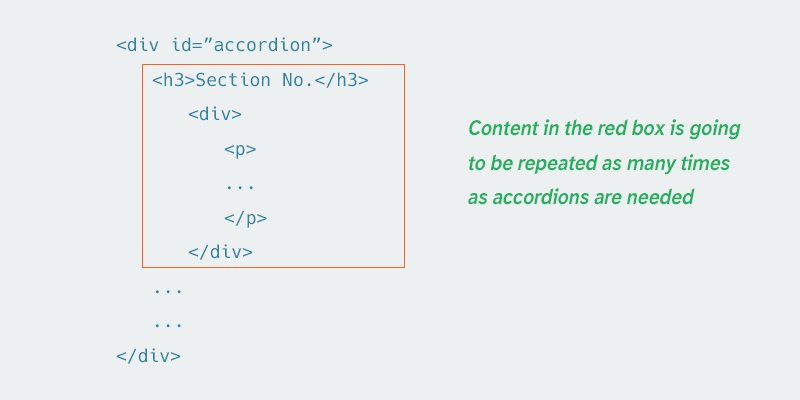
Now let’s fill this structured HTML with some text inside:
<!-- HTML SECTION  -->
<div id="accordion">
  <h3>Section 1</h3>
  <div>
    <p>
    Mauris mauris ante, blandit et, ultrices a, suscipit eget, quam. Integer
    ut neque. Vivamus nisi metus, molestie vel, gravida in, condimentum sit
    amet, nunc. Nam a nibh. Donec suscipit eros. Nam mi. Proin viverra leo ut
    odio. Curabitur malesuada. Vestibulum a velit eu ante scelerisque vulputate.
    </p>
  </div>
  <h3>Section 2</h3>
  <div>
    <p>
    Sed non urna. Donec et ante. Phasellus eu ligula. Vestibulum sit amet
    purus. Vivamus hendrerit, dolor at aliquet laoreet, mauris turpis porttitor
    velit, faucibus interdum tellus libero ac justo. Vivamus non quam. In
    suscipit faucibus urna.
    </p>
  </div>
  <h3>Section 3</h3>
  <div>
    <p>
    Nam enim risus, molestie et, porta ac, aliquam ac, risus. Quisque lobortis.
    Phasellus pellentesque purus in massa. Aenean in pede. Phasellus ac libero
    ac tellus pellentesque semper. Sed ac felis. Sed commodo, magna quis
    lacinia ornare, quam ante aliquam nisi, eu iaculis leo purus venenatis dui.
    </p>
    <ul>
      <li>List item one</li>
      <li>List item two</li>
      <li>List item three</li>
    </ul>
  </div>
  <h3>Section 4</h3>
  <div>
    <p>
    Cras dictum. Pellentesque habitant morbi tristique senectus et netus
    et malesuada fames ac turpis egestas. Vestibulum ante ipsum primis in
    faucibus orci luctus et ultrices posuere cubilia Curae; Aenean lacinia
    mauris vel est.
    </p>
  </div>
</div>
The basic syntax for jQuery UI Accordion application is: $(selector, context).accordion (options); By applying it in our example we’d get:
<!-- JAVASCRIPT SECTION  -->
<script type="text/javascript">
$(function() {
    $( "#accordion" ).accordion();
});
</script>
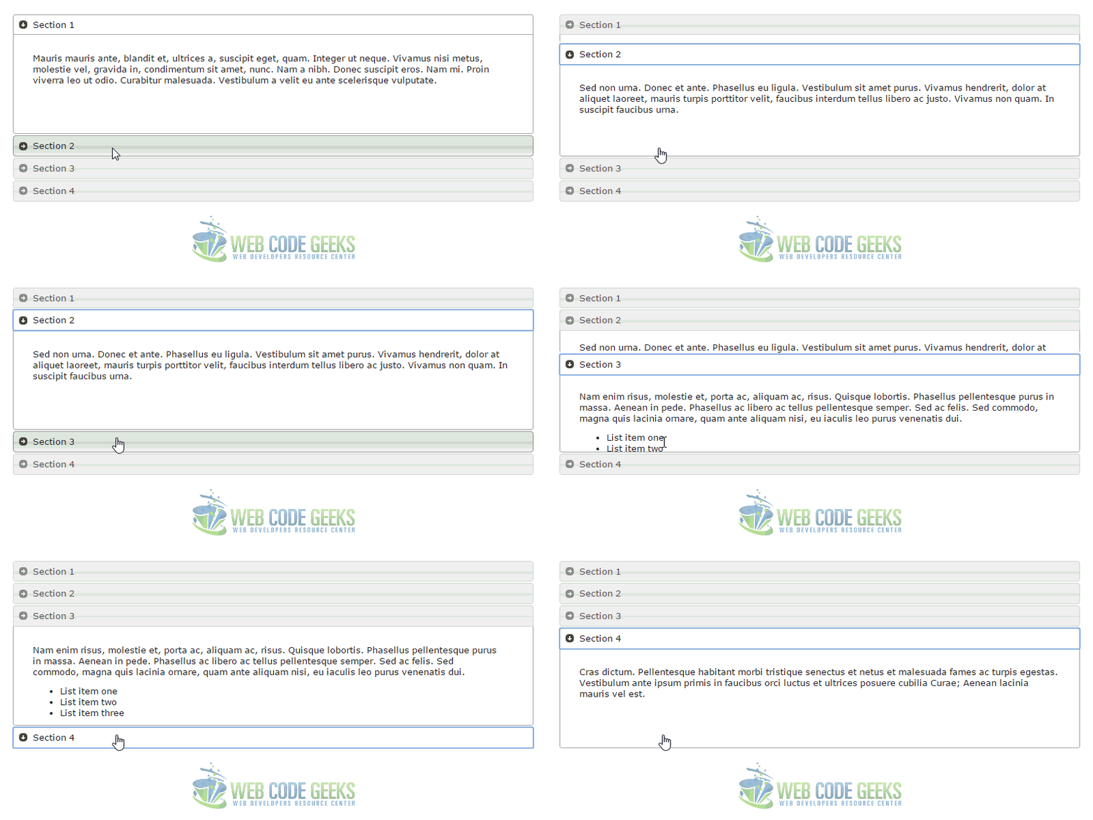
This code creates an accordion for the structured div that has the id of accordion. Note that it is only going to work if the whole thing is declared as an anonymous function. The result we’d get in the browser would be:
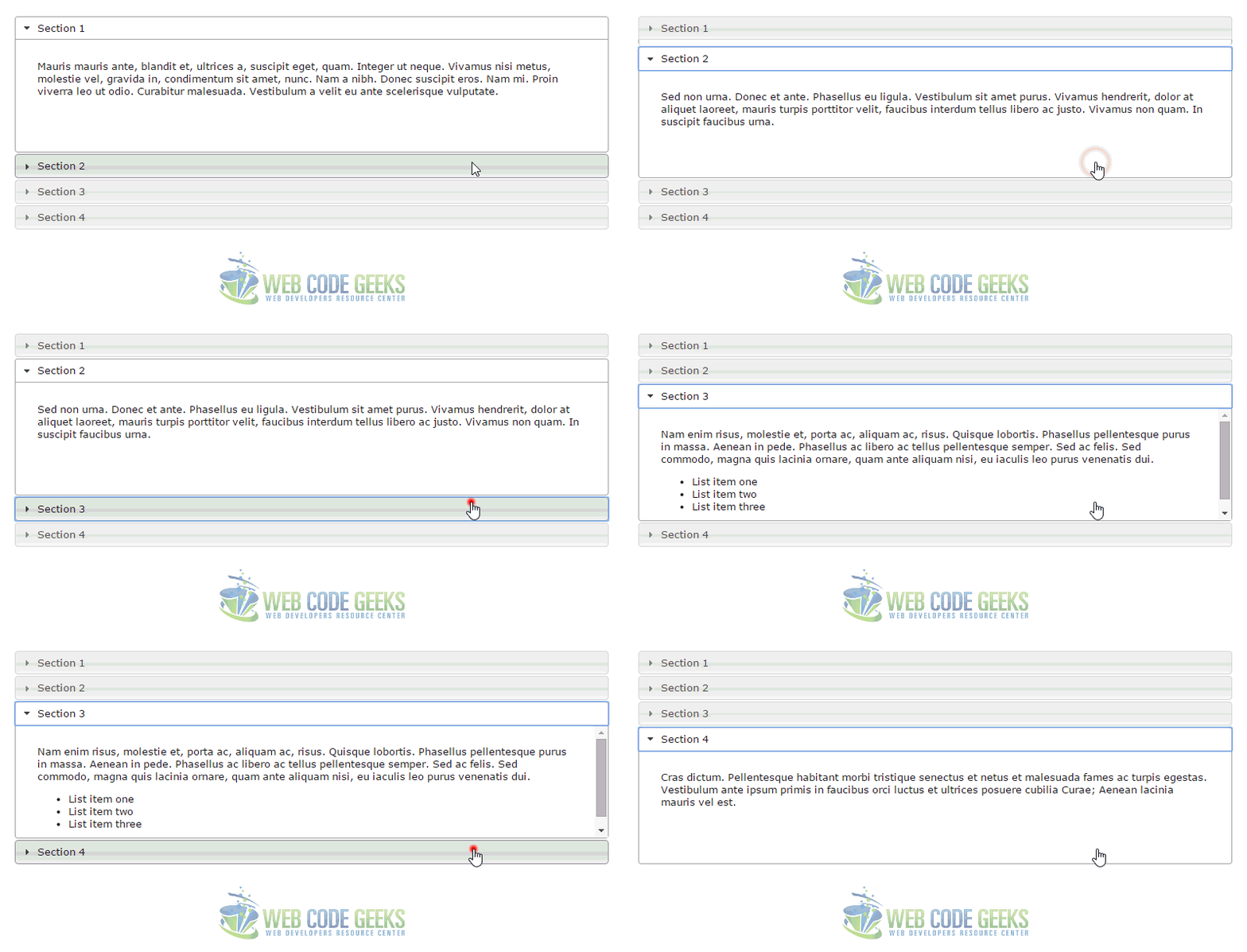
3. Accordion Examples
Below, we’ll have a look at the various cases and examples in which we can use accordions.
3.1 Collapse Content
By default, accordions always keep one section open. To allow for all sections to be be collapsible, set the collapsible option to true. Your code would look something like this:
<!-- JAVASCRIPT SECTION  -->
<script type="text/javascript">
$(function() {
    $( "#accordion" ).accordion({
        collapsible: true
    });
});
</script>
3.2 Customize Icons
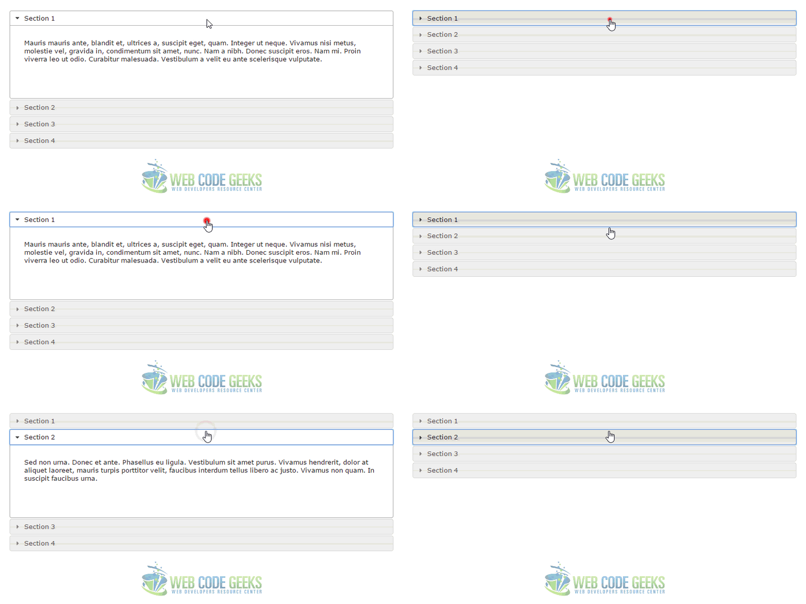
Customize the header icons with the icons option, which accepts classes for the header’s default and active (open) state. You can use any class from the UI CSS framework, or create custom classes with background images. Example:
<!-- JAVASCRIPT SECTION  -->
<script type="text/javascript">
var icons = {
      header: "ui-icon-circle-arrow-e",
      activeHeader: "ui-icon-circle-arrow-s"
    };
$(function() {
    $( "#accordion" ).accordion({
        icons: icons
    });
});
</script>
3.3 Fill Space
Because the accordion is comprised of block-level elements, by default its width fills the available horizontal space.
First, wrap your current HTML inside a new div:
<div id="accordion-resizer" class="ui-widget-content">
 // your initial HTML here
<div>
Next, set an initial accordion resizer size to whatever you like.
<style type="text/css">
    #accordion-resizer {
    padding: 10px;
    width: 350px;
    height: 220px;
  }
</style>
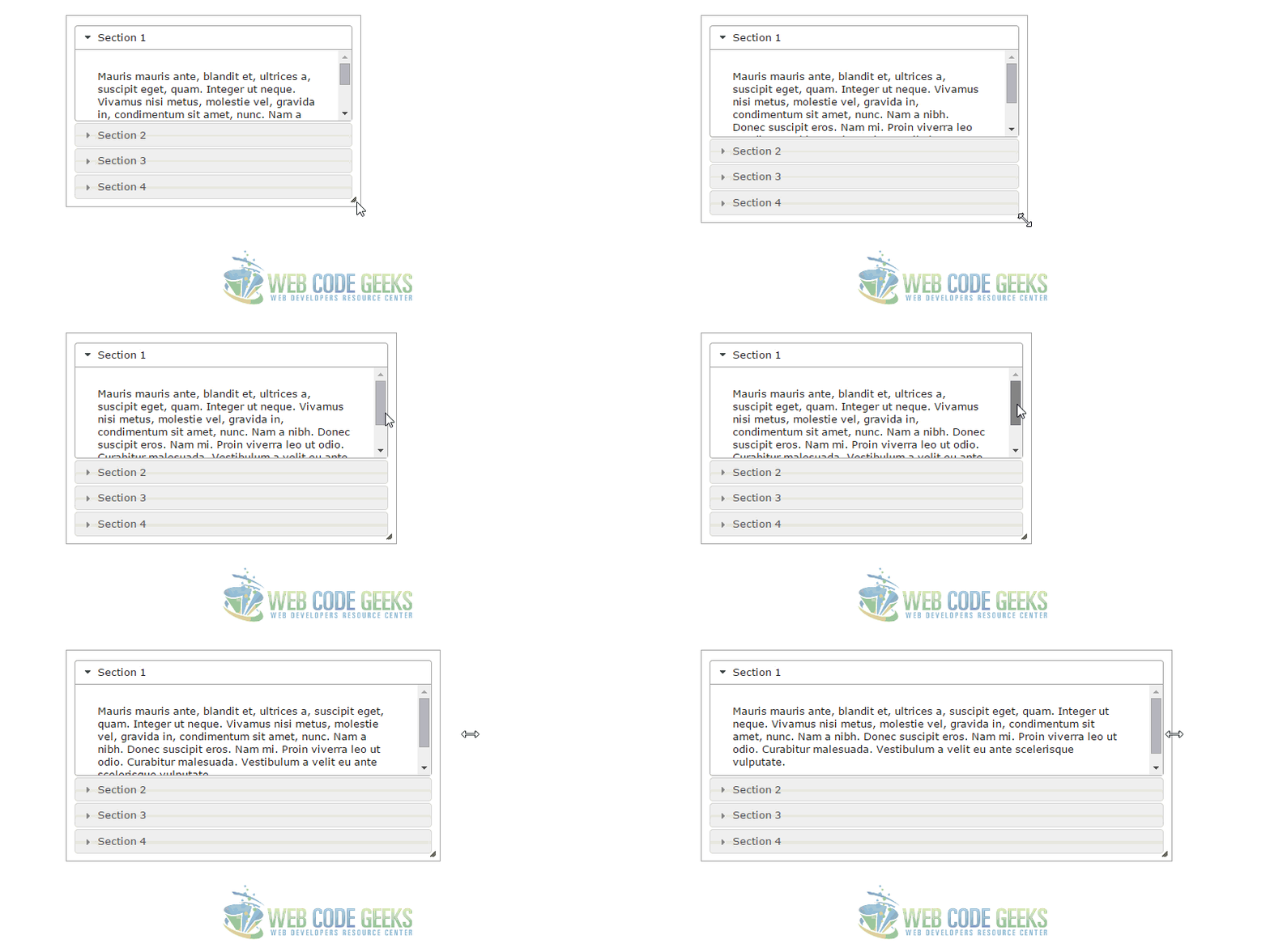
To fill the vertical space allocated by its container, set the heightStyle option to "fill", and the script will automatically set the dimensions of the accordion to the height of its parent container.
<!-- JAVASCRIPT SECTION  -->
<script type="text/javascript">
$(function() {
    $( "#accordion" ).accordion({
      heightStyle: "fill"
    });
  });
  $(function() {
    $( "#accordion-resizer" ).resizable({
      minHeight: 140,
      minWidth: 200,
      resize: function() {
        $( "#accordion" ).accordion( "refresh" );
      }
    });
  });
</script>
3.4 No Auto Height
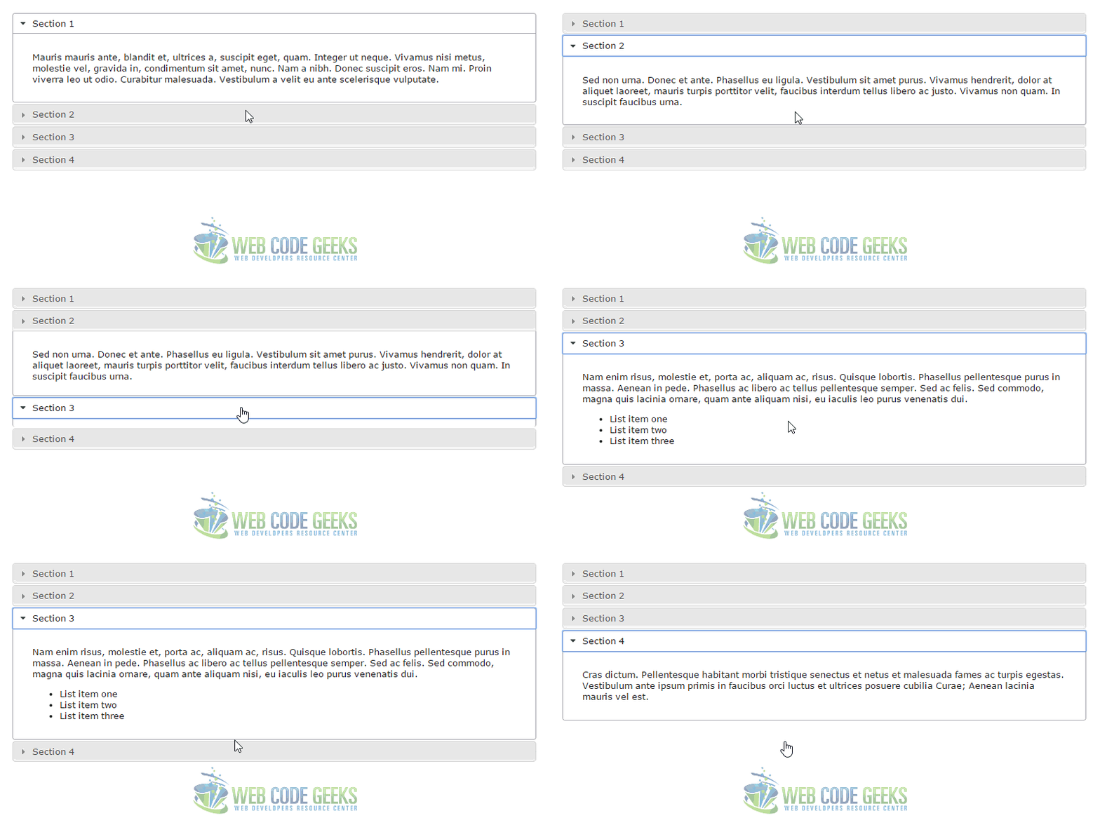
Setting heightStyle: "content" allows the accordion panels to keep their native height.
<!-- JAVASCRIPT SECTION  -->
<script type="text/javascript">
  $(function() {
    $( "#accordion" ).accordion({
      heightStyle: "content"
    });
  });
</script>
3.5 Open on Hoverintent
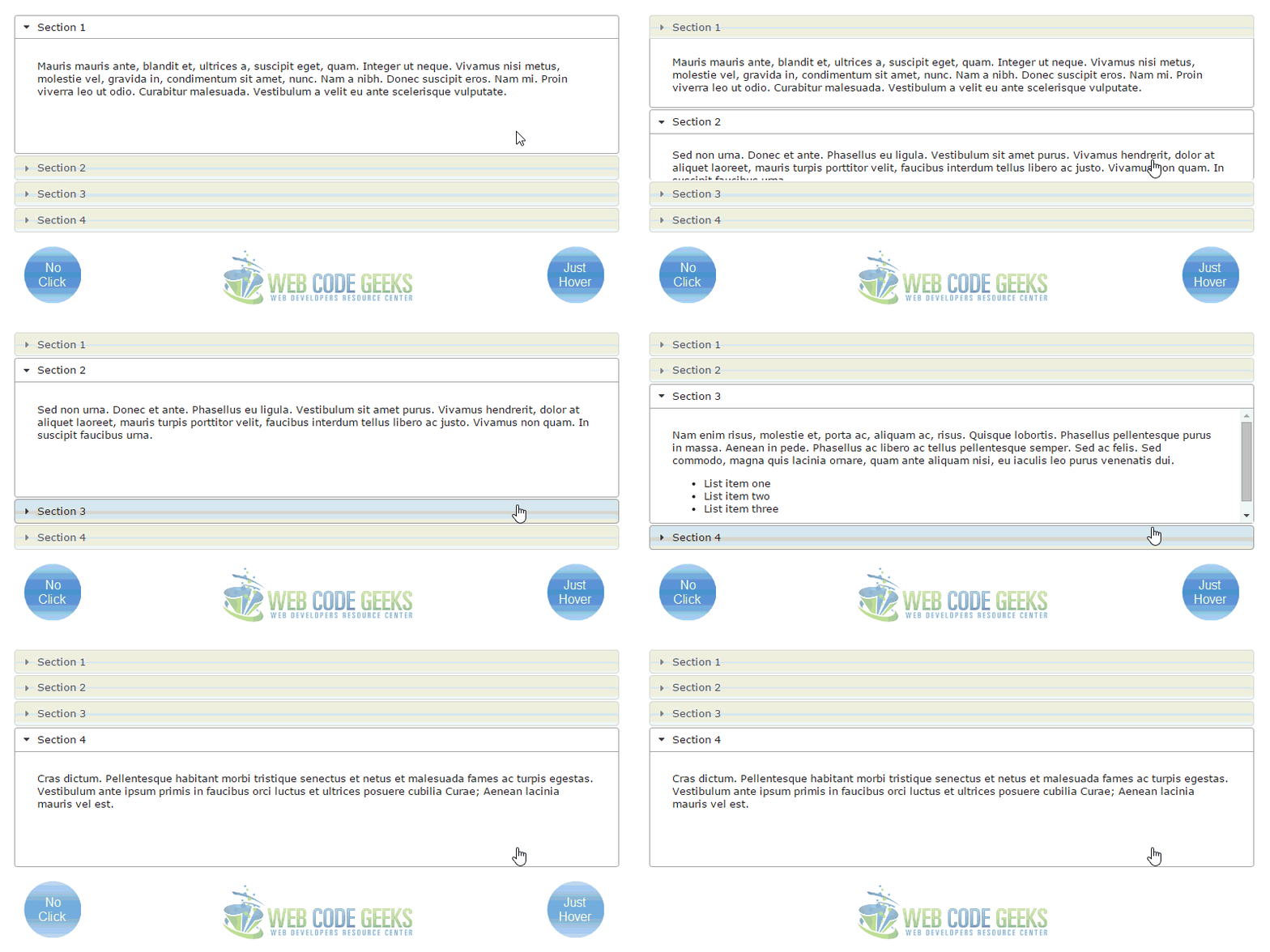
Click headers to expand/collapse content that is broken into logical sections, much like tabs. Optionally, toggle sections open/closed on mouseover. Because this a bit complicated, you’d better have a closer look in the official jQuery Website: https://jqueryui.com/accordion/#hoverintent.
4. Conclusion
To conclude, accordions enable users to click headers to expand/collapse content that is broken into logical sections, much like tabs. The widget is fast and easy to use in most cases. It is quite a great way to organise content and get more efficent on your website layouts/spaces. You will find it useful if you want to explain sth with steps, describe people ect.
5. DownloadDownload
You can download the full source code of this example here: jQuery UI Accordion
You can download the full source code of this example here: jQuery UI Accordion



Help! In your links section above…. your versions of jquery-ui.css (1.11.4), jquery.min.js (1.11.3), jquery-ui.min.js (1.11.4).
In my ASP.Net MVC page, I have jquery-2.2.0.min.js, but not a 1.11.4. Is it okay that these are different versions?
How do I know that the jquery-2.2.0.min.js is the most recent version?
How do I know what order these go in? I also have jquery.easing.1.3.min.js, jAlert-functions.js, jAlert-v3.js, modernizr-2.8.3.js, and jquery.globalize.min.js. I get confused what order they should load in, or even if that matters.
Also, can I trust NuGet to keep these updated?
Link to Open on Hoverintent not exists.