jQuery UI Datepicker Example
In this example, we’ll have a look at the datepicker widget of jQuery. The jQuery UI Datepicker is a highly configurable plugin that adds datepicker functionality to your pages. You can customize the date format and language, restrict the selectable date ranges and add in buttons and other navigation options easily.
By default, the datepicker calendar opens in a small overlay when the associated text field gains focus. For an inline calendar, simply attach the datepicker to a div or span.
There are quite some other javascript frameworks out there that offer the datepicker widget better designed, but that is up to you to decide.
1. Basic Setup & Application
The following sections will help you begin with the very basics.
1.1 Document Setup
To begin, create a new HTML document and add the following basic syntax to it:
<!DOCTYPE html>
<html>
<head>
	<title>jQuery Datepicker Example</title>
</head>
<body>

<!-- LINKS SECTION  -->
<link href="http://ajax.googleapis.com/ajax/libs/jqueryui/1.11.4/themes/smoothness/jquery-ui.css" rel="stylesheet" type="text/css"/>
<script src="http://ajax.googleapis.com/ajax/libs/jquery/1.11.3/jquery.min.js"></script>
<script src="http://ajax.googleapis.com/ajax/libs/jqueryui/1.11.4/jquery-ui.min.js"></script>
<link href="style.css" rel="stylesheet" type="text/css"/>

<!-- HTML SECTION  -->


<!-- JAVASCRIPT SECTION  -->
<script src="jquery-1.11.3.min.js"></script>

<script type="text/javascript">

</script>

</body>
</html>
Don’t forget to download or link jQuery library, otherwise the code won’t work. Other links of the jQuery UI are provided, so you don’t have to.
1.2 Default Functionality
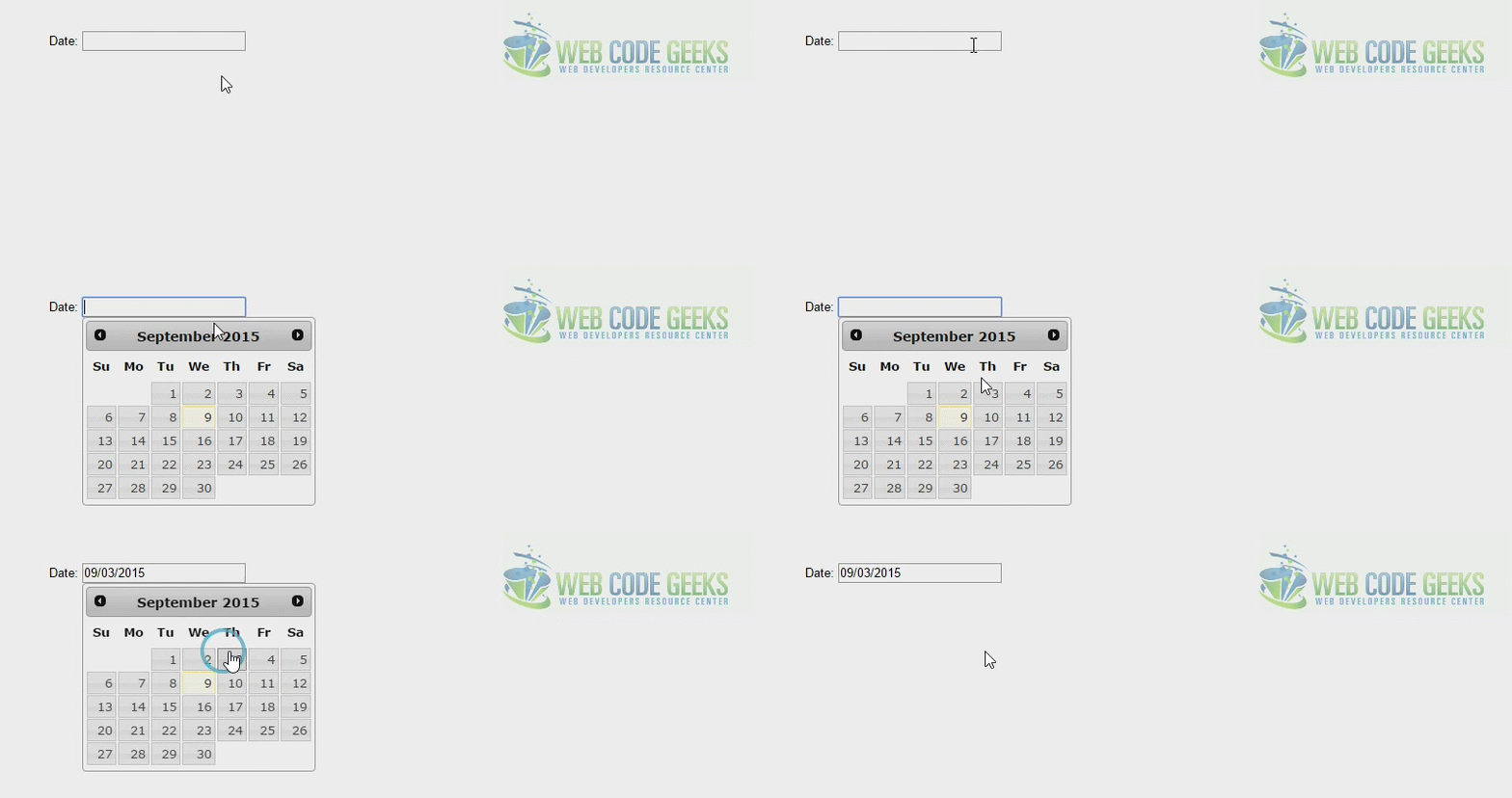
Let us begin with this very simple and basic datepicker. The datepicker is tied to a standard form input field. Focus on the input (click, or use the tab key) to open an interactive calendar in a small overlay. Choose a date, click elsewhere on the page (blur the input), or hit the Esc key to close. If a date is chosen, feedback is shown as the input’s value.
So, create a new p element in HTML and add some text like Date:. Inside the p add an input element and give it a class of .datepicker:
<!-- HTML SECTION  -->
<p>Date: <input type="text" class="datepicker"></p>
Now, to show a basic datepicker, in jQuery, create a new function where you select the .datepicker input field and add the .datepicker() method.
<!-- JAVASCRIPT SECTION  -->
<script type="text/javascript">
  $(function() {
    $( ".datepicker" ).datepicker();
  });
</script>
2. Options and Examples
The following section will expand on the various customizations the widget can have.
2.1 Animations
You can use different animations when opening or closing the datepicker. Choose an animation from the dropdown, then click on the input to see its effect. You can use one of the three standard animations or any of the UI Effects.
<!-- HTML SECTION  -->
<p>Date: <input type="text" class="datepicker" size="30"></p>

<p>Animations:<br>
  <select class="anim">
    <option value="show">Show (default)</option>
    <option value="slideDown">Slide down</option>
    <option value="fadeIn">Fade in</option>
    <option value="blind">Blind (UI Effect)</option>
    <option value="bounce">Bounce (UI Effect)</option>
    <option value="clip">Clip (UI Effect)</option>
    <option value="drop">Drop (UI Effect)</option>
    <option value="fold">Fold (UI Effect)</option>
    <option value="slide">Slide (UI Effect)</option>
    <option value="">None</option>
  </select>
</p>
<!-- JAVASCRIPT SECTION  -->
<script type="text/javascript">
  $(function() {
    $( ".datepicker" ).datepicker();
    $( ".anim" ).change(function() {
      $( ".datepicker" ).datepicker( "option", "showAnim", $(this).val() );
    });
  });
</script>
Look at the results in this video:
2.2 Dates in Other Months
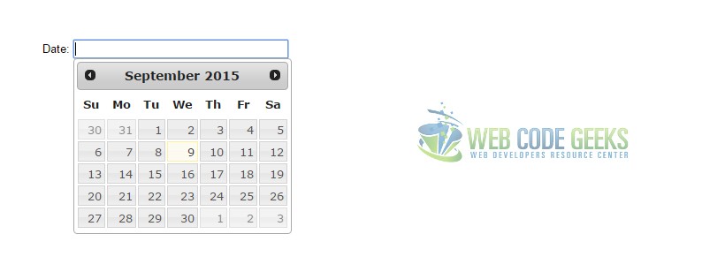
You might have noticed that the calendar does not show dates that are not of the current month. You can change that using the showOtherMonths and selectOtherMonths options. Just add these two lines inside your .datepicker() method.
<!-- JAVASCRIPT SECTION  -->
<script type="text/javascript">
  $(function() {
    $( ".datepicker" ).datepicker({
        showOtherMonths: true,
        selectOtherMonths: true
    });
  });
</script>
2.3 Display Button Bar
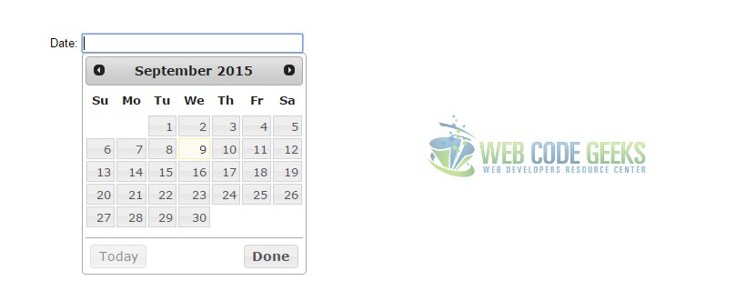
Display a button for selecting Today’s date and a Done button for closing the calendar with the boolean showButtonPanel option. Each button is enabled by default when the bar is displayed, but can be turned off with additional options. Button text is customizable.
<!-- JAVASCRIPT SECTION  -->
<script type="text/javascript">
  $(function() {
    $( ".datepicker" ).datepicker({
        showButtonPanel: true
    });
  });
</script>
2.4 Display Month and Year Menus
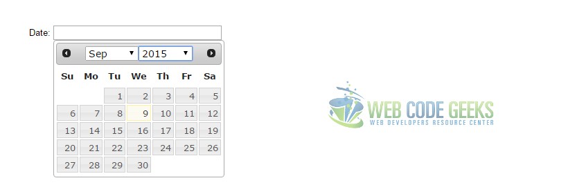
Show month and year dropdowns in place of the static month/year header to facilitate navigation through large timeframes. Add the boolean changeMonth and changeYear options.
<!-- JAVASCRIPT SECTION  -->
<script type="text/javascript">
    $(function() {
    $( ".datepicker" ).datepicker({
      changeMonth: true,
      changeYear: true
    });
  });
</script>
2.5 Display Multiple Months
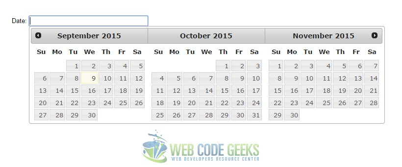
Set the numberOfMonths option to an integer of 2 or more to show multiple months in a single datepicker.
<!-- JAVASCRIPT SECTION  -->
<script type="text/javascript">
    $(function() {
    $( ".datepicker" ).datepicker({
      numberOfMonths: 3
    });
  });
</script>
2.6 Select a Date Range
Select the date range to search for.
<!-- HTML SECTION  -->
<label for="from">From</label>
<input type="text" id="from" name="from">
<label for="to">to</label>
<input type="text" id="to" name="to">
<!-- JAVASCRIPT SECTION  -->
<script type="text/javascript">
  $(function() {
    $( "#from" ).datepicker({
      defaultDate: "+1w",
      changeMonth: true,
      numberOfMonths: 3,
      onClose: function( selectedDate ) {
        $( "#to" ).datepicker( "option", "minDate", selectedDate );
      }
    });
    $( "#to" ).datepicker({
      defaultDate: "+1w",
      changeMonth: true,
      numberOfMonths: 3,
      onClose: function( selectedDate ) {
        $( "#from" ).datepicker( "option", "maxDate", selectedDate );
      }
    });
  });
</script>
2.7 Icon Trigger
Click the icon next to the input field to show the datepicker. Set the datepicker to open on focus (default behavior), on icon click, or both.
<!-- JAVASCRIPT SECTION  -->
<script type="text/javascript">
  $(function() {
    $( ".datepicker" ).datepicker({
      showOn: "button",
      buttonImage: "calendar.png",
      buttonImageOnly: true,
      buttonText: "Select date"
    });
  });
</script>

2.8 Format Date
Display date feedback in a variety of ways. Choose a date format from the dropdown, then click on the input and select a date to see it in that format.
<!-- HTML SECTION  -->
<p>Format options:<br>
  <select class="format">
    <option value="mm/dd/yy">Default - mm/dd/yy</option>
    <option value="yy-mm-dd">ISO 8601 - yy-mm-dd</option>
    <option value="d M, y">Short - d M, y</option>
    <option value="d MM, y">Medium - d MM, y</option>
    <option value="DD, d MM, yy">Full - DD, d MM, yy</option>
    <option value="'day' d 'of' MM 'in the year' yy">With text - 'day' d 'of' MM 'in the year' yy</option>
  </select>
</p>
<!-- JAVASCRIPT SECTION  -->
<script type="text/javascript">
    $(function() {
    $( ".datepicker" ).datepicker();
    $( ".format" ).change(function() {
      $( ".datepicker" ).datepicker( "option", "dateFormat", $(this).val() );
    });
  });
</script>
3. Conclusion
To conclude, the datepicker widget of jQuery UI is a complete solution for developers whenever it comes to getting a date information or a period of time from the user. The datepicker is very used in airlines, hotels and other reservation websties. It is easy to implement and use in jQuery and you can use jQuery UI themes to have a different design.
4. Download
You can download the full source code of this example here: jQuery Datepicker



How about an example with multiple highlighted dates for appointments or holidays. Even better the highlighted dates should have a pop-up to tell you what the highlighted date is. Better, yet, add embedded icons/glyphs such as a flag, Star of David, christmas tree for the 4th of July, the 1st day of Rosh Hashanah, Christmas, etc, to the highlighted date. And best of all to have the holidays/appointments dates, comments, and symbols be managed with a function that could be called with individual data input by the user or by a database loader. I know that this is a lot,… Read more »
Here is an example that partly shows how multiple dates can be marked and cleared based on your example: http://codepen.io/howardb1/pen/LRRyxz In this example all of the events use the same css background image, but in a ‘real-world’ version the images shown on each event date could easily be changed to match the event, by creating different event classes and assigning them to the event array along with the tooltip title message that in your example contain the date*, i.e.: { ‘July4thEvent_CSSRuleName’, ‘Happy 4th!’ } Which is then used them in the beforeShowDay function return statement. I’m working on how to… Read more »