Interaction Design 101: What Is It and How Can You Implement It in Your Site?
There was a time when websites were purely visual. The information you sought was displayed on your computer screen — information like directory contents, magazine articles, or photographs — without any user interaction. Thanks to various developments in computer hardware and media, websites have become much more than that. Today, users do not just visit a website to browse through its contents—they actually interact with it.
Take Apps, for example: On its homepage, it welcomes visitors with an action simulator for making apple cider. Users are guided through the whole process, replete with animation, music, and narration, while they are also required to press keys to proceed.
Compare that with this website from the ’90s below. Which one do you think users would enjoy interacting with more?

Ensuring optimal interaction between the website you build and its users is key to creating a good user experience (UX), which in turn affects how people perceive both the website and the brand it represents. These online interactions are also how people usually “meet” brands for the first time, so it’s important that websites create positive first impressions through smart interaction design.
Defining Interaction Design
Interaction design is a concept focused on creating interfaces that support meaningful interactions between websites and users. It ensures that each element of the website behaves in a way that both engages users and helps them accomplish their goals efficiently.
The purpose of interaction design is to provide users with a seamless experience whenever they visit a website. It involves the interplay of many disciplines, including information structure, content strategy, and visual design.
To become an effective interaction designer, one must have a rich understanding of human behavior as well as the ability to anticipate how users will interact with the different elements of the website.
The Five Dimensions of Interaction Design
When building an app or website, you can follow these five dimensions of interaction design as a guide.
1. Words
Your website’s written content is invaluable, but even more so if it’s written with your intended audience in mind. Give users value by being informative and using words that are clear, concise, and easy to understand.
2. Visual Representations
Most people are visual in nature, so the images, icons, diagrams, typography, and other graphical elements in your website will be just as important as written content. Use graphics that capture users’ attention and lead them to interact with the other content on the website.
3. Physical Objects or Space
It’s not just the website elements themselves that matter but also where you put them on the page. Be mindful of the space between different objects so your site doesn’t look cluttered and hard to navigate. Additionally, people now use different devices to access the internet, so your website’s design must adjust to different screen sizes instead of being optimized solely for a desktop.
4. Time
This refers to how users perceive the duration of their stay on your site with the help of changing media like animation and sounds. For example, this loading animation for a brewing website not only rouses the interest of visitors, but it also pacifies the impatience brought about by waiting. Elements like this provide users with the means to track their progress, adding to the seamlessness of the interaction.

5. Behavior
This dimension looks at what visitors do on the website and how you can use their emotional feedback to improve the user experience. For example, if you find that users complain about the checkout process of your e-commerce site, ask them what particular elements add friction to their experience. Was it the requirement to sign up? Was it a perceived lack of security?
Take a close look at how they interact with the product and the different elements of the site. Determine, too, how the four previously mentioned dimensions influenced their behavior.
The Laws of Creating Positive Interactions
You can follow these three laws to ensure positive interactions between your website and its visitors.
Hick’s Law
People tend to take longer to decide the more options they have in front of them, according to psychologist William Edmund Hick. Help your website’s users save time by dividing options into sections, much like how many e-commerce sites segment their products into different categories. This simplifies the decision-making process and improves the overall experience for users.
Fitts’ Law
Fitts’ law posits that bigger objects are easier to find and point out. You can apply this to web design by making the buttons and menus on your site bigger and easier to interact with.
Tesler’s Law
Larry Tesler, former Apple vice president, once said that every application can be simplified only up to a certain point. Once simplification becomes impossible, the designer can opt to move the complexity to the backstage processes, leaving users with a design that’s both minimalistic and easy to navigate.
For example, on Airbnb there are very basic options on the homepage: either book a place or rent out space. If you’re interested in the former, you just type in a location, input the dates, and number of guests. From there, they move you on to more complicated tasks like looking for your preferred place, price, and inputting more information.

Eight Best Practices in Interaction Design
Follow these best practices when building a website.
1. Ensure Discoverability
Make sure users know what they can do on your website, by labeling icons. Encountering unfamiliar icons can throw them off and prevent them from getting the most out of their visit.

As you can see in the examples above, the icons are clearly labeled, making all the options available to users crystal clear. Not only can you see what the possible interactions are, you know exactly what they do.
2. Provide Signifiers
Add signifiers that indicate what users can do on the page. A good example of this is when a clickable icon changes color once the mouse pointer hovers over it.

As you can see above, hovering over a certain part of an email brings up the icon signifying that you can delete an email. While it’s not always visible to users, signifiers tell them when an action’s possible.
3. Offer Feedback
Provide users with explicit information about the process and the results of their action on the website. Tell them what will happen when they click something. They also need to know if the system is loading, processing, downloading, or something else.
For example, when you submit a form and input something incorrect, the field where you made an error is usually highlighted along with an X mark to let you know where you made the mistake.
4. Enable Mental Models
The interface of your app or website must be designed for ease of use so that users can form an accurate mental model of how it’s used or what it can do. Bad user interface (UI) design can lead to confusion and error.
For example, Mercedes’ seat controls are shaped like a car seat. This allows users to intuitively know how to control what.

In contrast, look at how Skype’s UI strayed away from standard dialogues, causing confusion. Apart from the complicated language, the options don’t even look like dialogue buttons.

Mental models are users’ expectations based on previous experiences with similar products. Unexpected surprises can lead to confusion and, ultimately, frustration.
5. Establish Constraints
To minimize errors and confusion, it’s important that your UI set limits on what users can do. Restrict options only to what is doable and important at any given moment instead of laying down all possible choices.

6. Ensure Consistency
To make your interface consistent, make sure that the same operation is used to perform similar tasks. For instance, if swiping right means an affirmative response in one instance, it must be so for other instances as well.

7. Follow Common Patterns
Innovation is great, but following established patterns can lead to a better user experience and improved learnability. For example, use familiar UI components such as:
- Search boxes.
- Dropdown menus.
- Sliders.
- Icons.
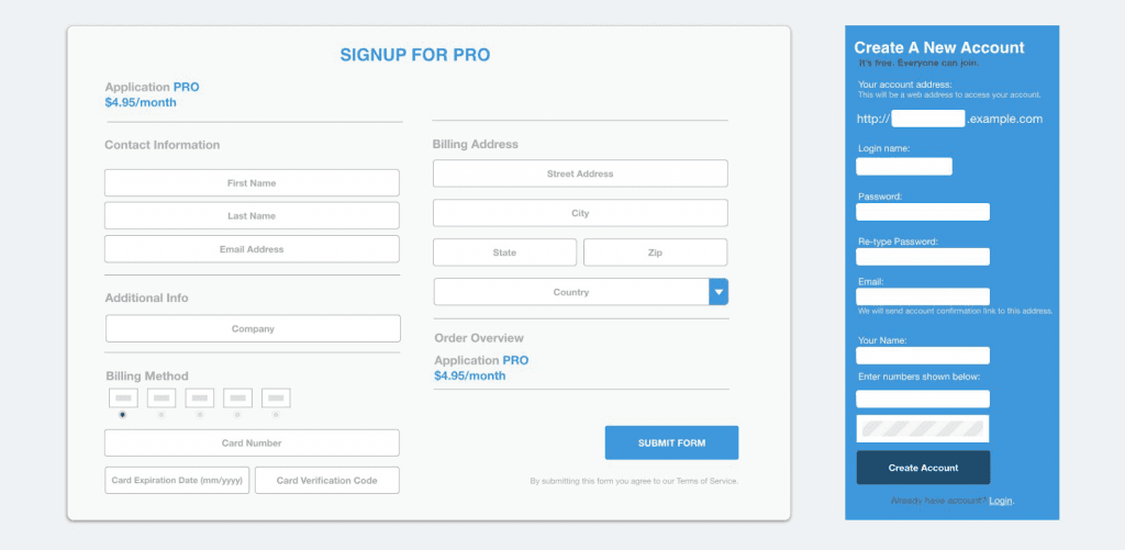
The use of common elements such as these is why most forms have a standardized look.

8. Use Visual Hierarchy
Assign the contents of your site according to importance. You could make certain elements stand out—and make them appear important—by making them bigger or of a different color than the rest of your website’s contents. You can see this in the contrasting image sizes below.

Tips to Improve Your Interaction Design Skills
You don’t become better at interaction design overnight. Here are some tips to improve at it.
1. Listen
This is the only way to obtain feedback. Whether it’s during the testing phase, from user comments, or even from other designers—listening is crucial to ensure that all aspects of your interaction design lead to a seamless user experience.
For example, you may have the perfect web design for first-time visitors, but it might not be optimal for return visits. This is the kind of realization you can get if you listen to standard practice.
2. Communicate Clearly
One of the best ways to communicate is by telling a story. Try to understand the story of the brand and convey this tale through the elements of your design. To ensure that you engage users effectively, make sure to avoid jargon in your written content. Keep everything clear and simple.
3. Develop Several Ideas
Conceptualizing new ideas is tough, but don’t settle for whatever you think of first. Always try to come up with several concepts. This way, you can effectively compare the good from the bad. Also, don’t be afraid to recycle old ideas to solve new problems.
4. Use a Pen
Many designers feel compelled to create their final product as soon as they can, skipping valuable steps in the process. To avoid mistakes and save time, it’s best to draw and test your ideas using a good ol’ pen and paper before converting them into pixels.
On a related note, use a pen to take note of any good ideas that come to your mind. This trick will let you remember concepts better than by typing notes in digital devices.
5. Visit Usability Testing Sessions
Nothing gives you a clearer picture of how your app or website performs than seeing your intended users actually use it. Usability testing sessions are useful testing tools that let you see users interact with your website firsthand, giving you valuable data on what improvements to implement.
Good Interaction Design = Good User Experience
Websites have long become more than mere repositories of information. Today, customers can base their opinions of a brand on their interactions and experience with the brand’s website. A website that successfully promotes a brand, therefore, is not just attractive but also carefully designed to provide users with a positive and meaningful experience every time.
What is your idea of good interaction design? Tell us in the comments.
Published on Web Code Geeks with permission by Naida Alabata, partner at our WCG program. See the original article here: Interaction Design 101: What Is It and How Can You Implement It in Your Site? Opinions expressed by Web Code Geeks contributors are their own. |


I simply wanted to say thanks again. I’m not certain the things I would’ve carried out in the absence of these points provided by you regarding such field. It was before a real daunting difficulty in my view, nevertheless considering the very skilled style you treated the issue took me to jump with fulfillment. Extremely grateful for the advice and then expect you comprehend what a great job that you’re putting in training the rest all through your site. Most likely you’ve never met all of us.